rootwa sagar

Approach
The Banyan redesign had a simple constraint: a team of two designers supporting roughly 100 developers. At that ratio, consistency can’t rely on review. My goal was to create a sustainable design system that could scale with the product vision while still supporting the MVP, so I started by getting the foundations right.
I approached it in four phases:
01


Phase I:
Inventory and define the primitives.
Audit the components the product needed and lock in the atoms and molecules.
02
Phase II:
Standardize documentation.
Establish a consistent documentation pattern so everyone on the team produces the same quality of output.
03
Phase III:
Create a source of truth.
Introduce version control so the team could trust the system and rely on it.
04
Phase IV:
Make the system machine-readable.
Use Figma’s variables and MCP so AI could read the system and aid front end development
Phase I
Inventory and define the primitives
In order to identify all the required atoms and molecules, I created a digram to take a stock of the required inventory.
Color Palette
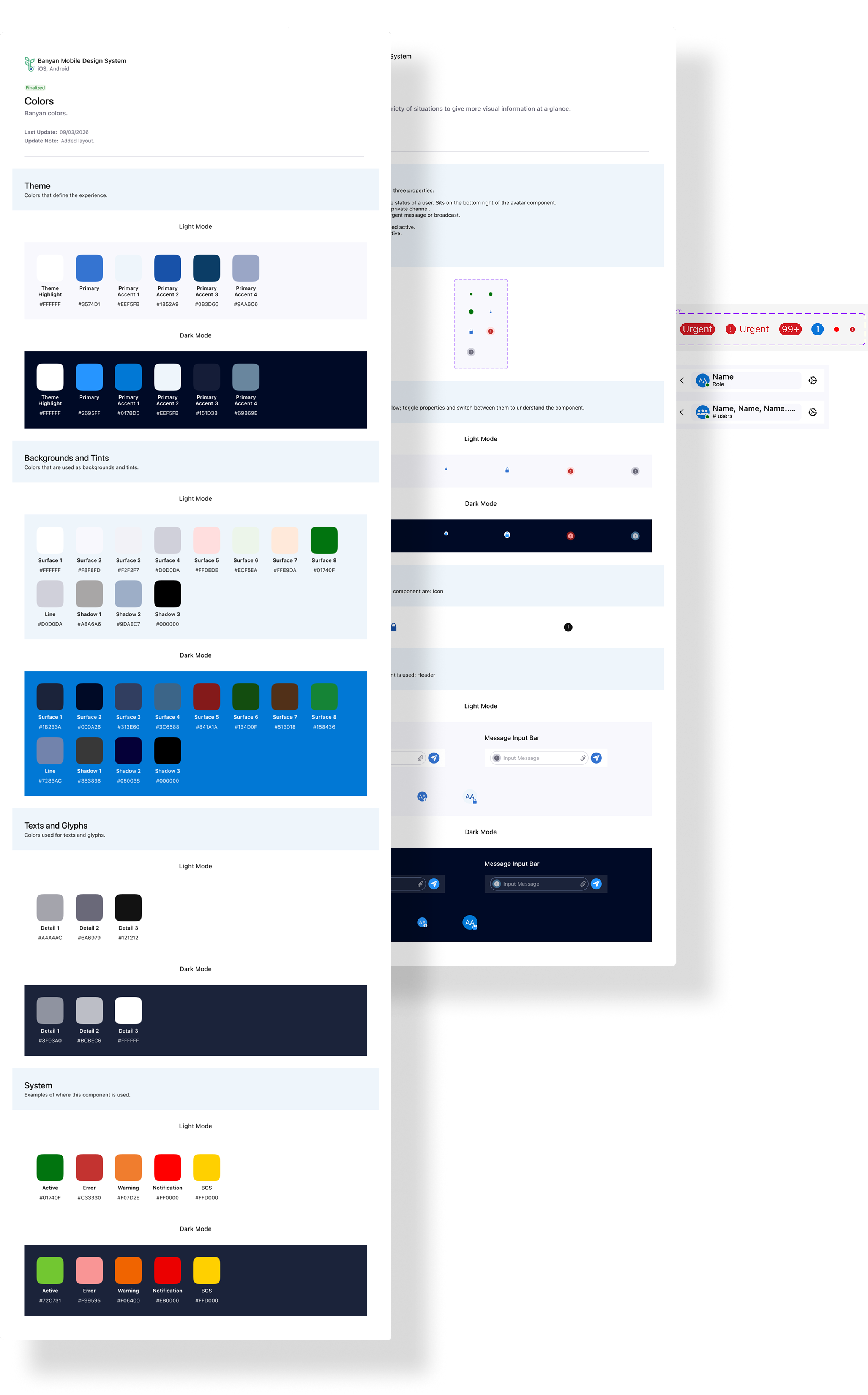
My goal was to deliver ADA-compliant light and dark themes out of the gate, targeting WCAG AA contrast ratios across both. Designing for two themes from the start had a useful side effect: it forced the token naming to be functional rather than literal. Instead of naming a color by its value (blue-500), tokens describe their role (primary, primary accent 1, surface-1, detail-1), so a theme can change without the names changing. That same decision made white-labeling possible at the MVP stage, future-proofing the system.
I tiered contrast by purpose as follows:
- AAA (7:1): the majority of text and background pairings
- AA (4.5:1): remaining text pairings
- 3:1 (graphics only): Holding these to 3:1 was a deliberate choice; it keeps the interface from feeling heavy while still meeting WCAG’s non-text contrast requirement. The clearest example is ’line’, the border color: because it exists as its own token, it can be kept out of text entirely.
Typography
My goal was to stay close to Apple’s typography guidelines because iOS had our larges user base at the time. While staying close to iOS standards, I wanted to add a custom layer on top, so token naming would be uniform across iOS, Android, and web.
Type also had to respond to iOS’s built-in text scaling, so I used the HIG as a model. Rather than deciding scalability at every typographic appearance, I bound it to the typography tokens themselves. Heading tokens don’t scale because headers have limited space, and scaling them could eat into it. Body text, which carries the content on screen, does scale, so users who enlarge their text can still read everything comfortably even though headers hold their size.
Button tokens were the deliberate exception, acting as a pressure valve for the system. I kept header and body rules strict so those tokens could never be used interchangeably, since that would make tokenizing them pointless. Whenever a case needed flexibility, the button class absorbed it, so the rules for headers and body stayed intact. That flexibility came with guardrails: no very small type sizes, and button colors always meet AAA contrast. The result is that scaling behavior is set once in the system for headers and body, and the one flexible class is constrained rather than open-ended.
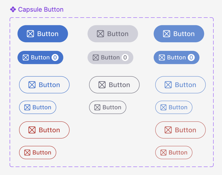
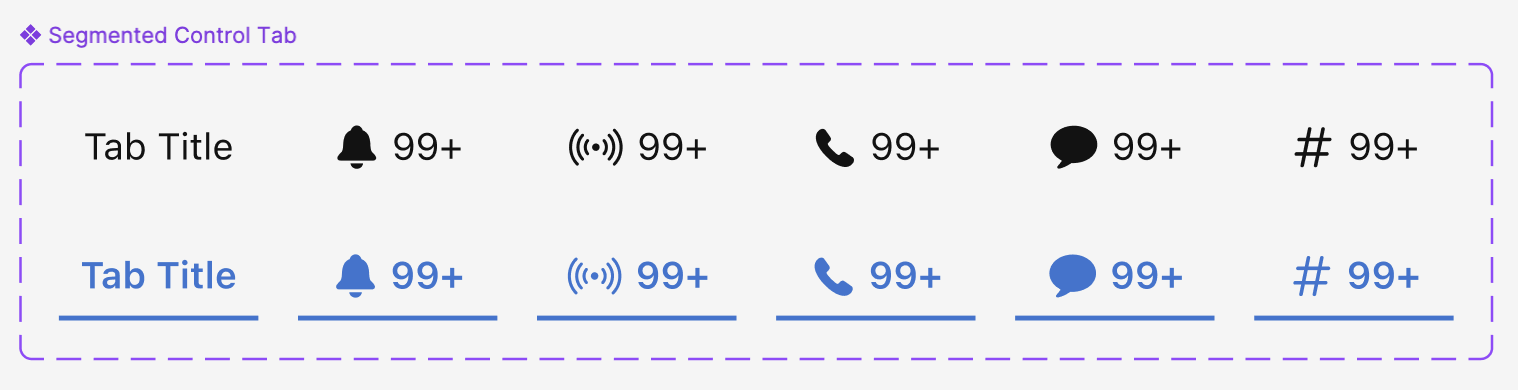
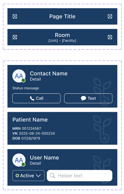
Timestamps, Buttons and Headers
Again, pulling from already existing resources; I studied SAP's Fiori guidelines on Timestamps, Microsoft's documentation and drew out the elements and the kinds of timestamps we would require for the client
Phase II
Standardize documentation
With the atoms and molecules solidified, I turned to documenting the patterns reused across the product, such as lists, filters, empty states, and navigation.
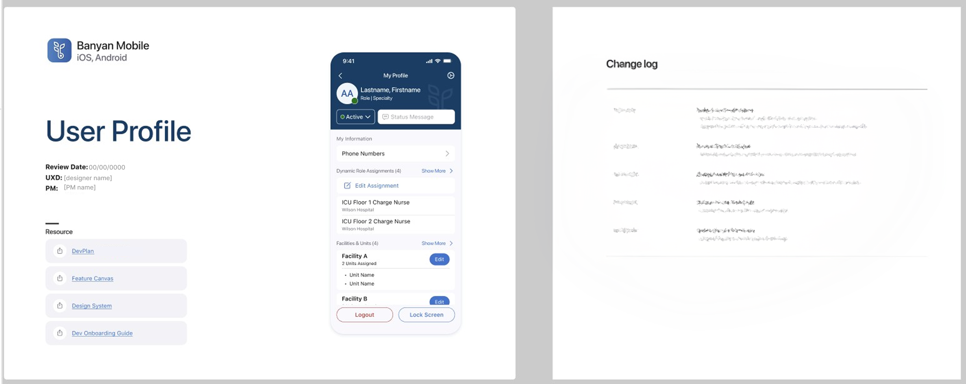
Documentation is only useful if people can actually use it, so I reviewed some pages with the development team to gauge how quickly they could understand its intent. Once I had a clear picture of what developers needed, I distilled it into a checklist that every page’s documentation must include:
- Cover page: links to the related product requirements, the Figma developer onboarding guide, and the design components documentation
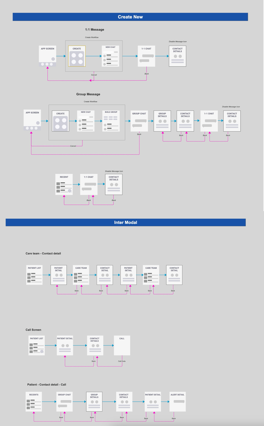
- Feature workflow: the initial flow of the feature, including edge cases
- Unique screens: a list of every distinct screen involved
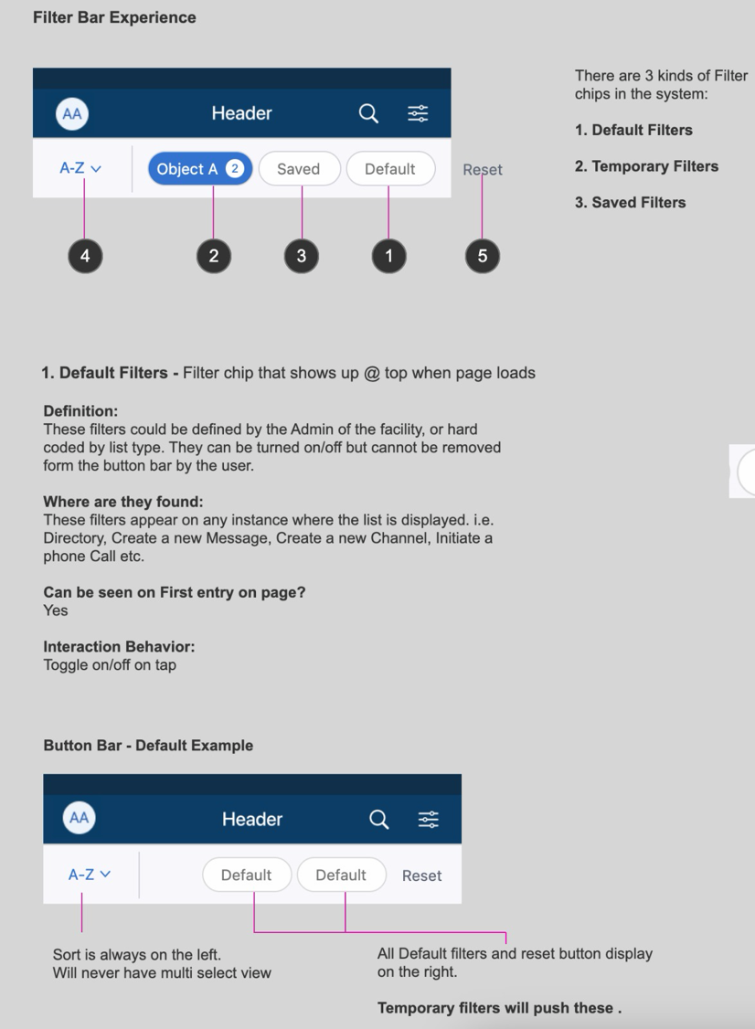
- Interaction notes: how elements behave, so nothing is left to interpretation
- Change log: the date and reason for every change
That way, a page documented by anyone on the team would answer the same questions in the same way, and developers would always know where to find what they needed.
Phase III
Create a source of truth
Version control started with the change log on every feature page, recording the date and reason for each change. But as I documented in the agreed format, the number of files grew too fast, with one per feature. With the documentation fragmented, no matter how detailed it was, it was pain to find it so it risked remaining unseen.
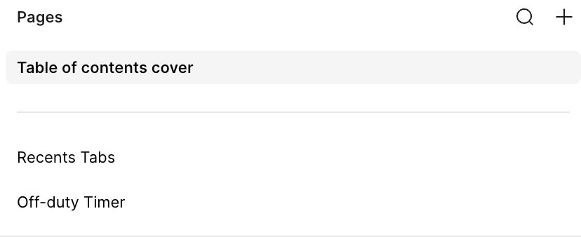
So I pivoted to a single file containing every feature, with each feature’s cover page and change log intact. Tickets could now point to one link, updates happened in one place, and the history of every change stayed on the page it belonged to.
It cut a lot of friction for everyone and quickly became the go-to place to find anything. Over time, people began contributing feedback on their own about what would make it more helpful, which told me the team trusted it.
Phase IV
Make the system machine readable
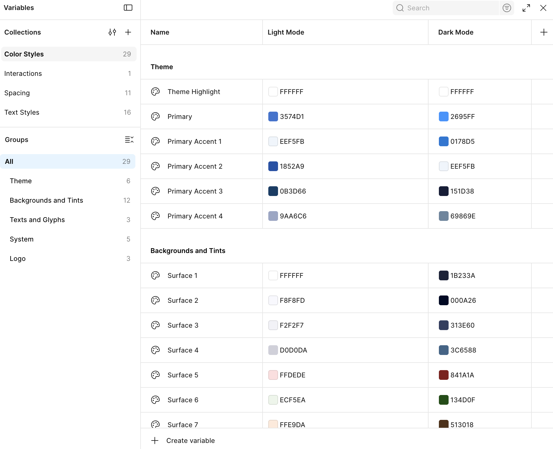
Color Variables
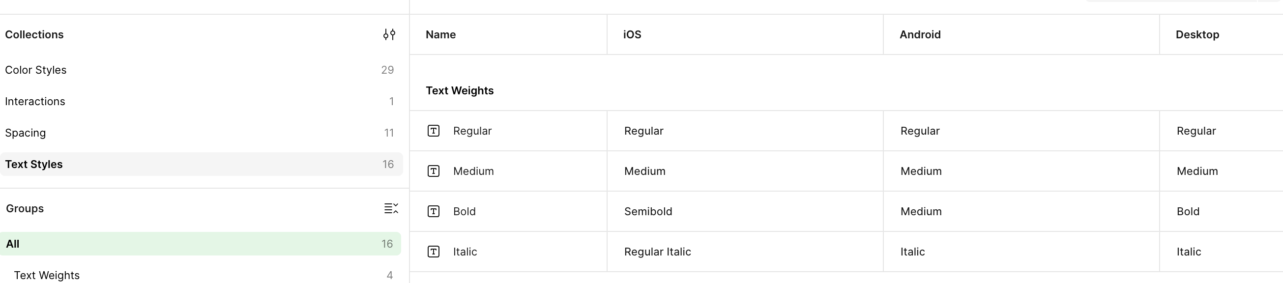
Type Variables
The components already lived in our design system documentation, but when Figma introduced variables, we took the opportunity to rewrite them. I moved the color tokens (light and dark), typography tokens, and spacing tokens into variables and rebuilt the components around them, working closely with a developer to structure everything so AI could consume it and shorten development time.
While exploring Code Connect, we found that Figma’s MCP was already doing a great job reading our design files and generating front-end code from our reusable components, without creating duplicates.
That made us question whether we needed Code Connect at all, so we decided to hold off for now, while watching it closely so we can make a case for it.
Next Steps
The MCP handles generation, and Code Connect prevents drift.
Our design system is large, and the current focus is the delivery end of the pipeline: using AI to generate front end. Further upstream, small component changes keep happening, especially new variants, and each one risks design and code falling out of sync. Code Connect’s automatic flagging would catch those inconsistencies as they happen, keeping both teams aligned as the system grows. I’m working with a development stakeholder to make that case and get up to a place where we don't have to constantly monitor the components manually. A developer and I have created a POC for the system but making sure the stakeholders are onboard is an important piece of the puzzle that I am working on right now.
Approach
The Banyan redesign had a simple constraint: a team of two designers supporting roughly 100 developers. At that ratio, consistency can’t rely on review. My goal was to create a sustainable design system that could scale with the product vision while still supporting the MVP, so I started by getting the foundations right.
I approached it in four phases:
01
Phase I:
Inventory and define the primitives.
Audit the components the product needed and lock in the atoms and molecules.
02
Phase II:
Standardize documentation.
Establish a consistent documentation pattern so everyone on the team produces the same quality of output.
03
Phase III:
Create a source of truth.
Introduce version control so the team could trust the system and rely on it.
04
Phase IV:
Make the system machine-readable.
Use Figma’s variables and MCP so AI could read the system and aid front end development
Phase I
Inventory and define the primitives
In order to identify all the required atoms and molecules, I created a digram to take a stock of the required inventory.
Color Palette
My goal was to deliver ADA-compliant light and dark themes out of the gate, targeting WCAG AA contrast ratios across both. Designing for two themes from the start had a useful side effect: it forced the token naming to be functional rather than literal. Instead of naming a color by its value (blue-500), tokens describe their role (primary, primary accent 1, surface-1, detail-1), so a theme can change without the names changing. That same decision made white-labeling possible at the MVP stage, future-proofing the system.
I tiered contrast by purpose as follows:
- AAA (7:1): the majority of text and background pairings
- AA (4.5:1): remaining text pairings
- 3:1 (graphics only): Holding these to 3:1 was a deliberate choice; it keeps the interface from feeling heavy while still meeting WCAG’s non-text contrast requirement. The clearest example is ’line’, the border color: because it exists as its own token, it can be kept out of text entirely.
Typography
My goal was to stay close to Apple’s typography guidelines because iOS had our larges user base at the time. While staying close to iOS standards, I wanted to add a custom layer on top, so token naming would be uniform across iOS, Android, and web.
Type also had to respond to iOS’s built-in text scaling, so I used the HIG as a model. Rather than deciding scalability at every typographic appearance, I bound it to the typography tokens themselves. Heading tokens don’t scale because headers have limited space, and scaling them could eat into it. Body text, which carries the content on screen, does scale, so users who enlarge their text can still read everything comfortably even though headers hold their size.
Button tokens were the deliberate exception, acting as a pressure valve for the system. I kept header and body rules strict so those tokens could never be used interchangeably, since that would make tokenizing them pointless. Whenever a case needed flexibility, the button class absorbed it, so the rules for headers and body stayed intact. That flexibility came with guardrails: no very small type sizes, and button colors always meet AAA contrast. The result is that scaling behavior is set once in the system for headers and body, and the one flexible class is constrained rather than open-ended.
Timestamps, Buttons and Headers
Again, pulling from already existing resources; I studied SAP's Fiori guidelines on Timestamps, Microsoft's documentation and drew out the elements and the kinds of timestamps we would require for the client
Phase II
Standardize documentation
With the atoms and molecules solidified, I turned to documenting the patterns reused across the product, such as lists, filters, empty states, and navigation.
Documentation is only useful if people can actually use it, so I reviewed some pages with the development team to gauge how quickly they could understand its intent. Once I had a clear picture of what developers needed, I distilled it into a checklist that every page’s documentation must include:
- Cover page: links to the related product requirements, the Figma developer onboarding guide, and the design components documentation
- Feature workflow: the initial flow of the feature, including edge cases
- Unique screens: a list of every distinct screen involved
- Interaction notes: how elements behave, so nothing is left to interpretation
- Change log: the date and reason for every change
That way, a page documented by anyone on the team would answer the same questions in the same way, and developers would always know where to find what they needed.
Phase III
Create a source of truth
Version control started with the change log on every feature page, recording the date and reason for each change. But as I documented in the agreed format, the number of files grew too fast, with one per feature. With the documentation fragmented, no matter how detailed it was, it was pain to find it so it risked remaining unseen.
So I pivoted to a single file containing every feature, with each feature’s cover page and change log intact. Tickets could now point to one link, updates happened in one place, and the history of every change stayed on the page it belonged to.
It cut a lot of friction for everyone and quickly became the go-to place to find anything. Over time, people began contributing feedback on their own about what would make it more helpful, which told me the team trusted it.
Phase IV
Make the system machine readable
The components already lived in our design system documentation, but when Figma introduced variables, we took the opportunity to rewrite them. I moved the color tokens (light and dark), typography tokens, and spacing tokens into variables and rebuilt the components around them, working closely with a developer to structure everything so AI could consume it and shorten development time.
While exploring Code Connect, we found that Figma’s MCP was already doing a great job reading our design files and generating front-end code from our reusable components, without creating duplicates.
That made us question whether we needed Code Connect at all, so we decided to hold off for now, while watching it closely so we can make a case for it.
Color Variables
Type Variables
Next Steps
The MCP handles generation, and Code Connect prevents drift.
Our design system is large, and the current focus is the delivery end of the pipeline: using AI to generate front end. Further upstream, small component changes keep happening, especially new variants, and each one risks design and code falling out of sync. Code Connect’s automatic flagging would catch those inconsistencies as they happen, keeping both teams aligned as the system grows. I’m working with a development stakeholder to make that case and get up to a place where we don't have to constantly monitor the components manually. A developer and I have created a POC for the system but making sure the stakeholders are onboard is an important piece of the puzzle that I am working on right now.
rootwa sagar
Approach
The Banyan redesign had a simple constraint: a team of two designers supporting roughly 100 developers. At that ratio, consistency can’t rely on review. My goal was to create a sustainable design system that could scale with the product vision while still supporting the MVP, so I started by getting the foundations right.
I approached it in four phases:
01
Phase I:
Inventory and define the primitives.
Audit the components the product needed and lock in the atoms and molecules.
02
Phase II:
Standardize documentation.
Establish a consistent documentation pattern so everyone on the team produces the same quality of output.
03
Phase III:
Create a source of truth.
Introduce version control so the team could trust the system and rely on it.
04
Phase IV:
Make the system machine-readable.
Use Figma’s variables and MCP so AI could read the system and aid front end development
Phase I
Inventory and define the primitives
In order to identify all the required atoms and molecules, I created a digram to take a stock of the required inventory.
Color Palette
My goal was to deliver ADA-compliant light and dark themes out of the gate, targeting WCAG AA contrast ratios across both. Designing for two themes from the start had a useful side effect: it forced the token naming to be functional rather than literal. Instead of naming a color by its value (blue-500), tokens describe their role (primary, primary accent 1, surface-1, detail-1), so a theme can change without the names changing. That same decision made white-labeling possible at the MVP stage, future-proofing the system.
I tiered contrast by purpose as follows:
- AAA (7:1): the majority of text and background pairings
- AA (4.5:1): remaining text pairings
- 3:1 (graphics only): Holding these to 3:1 was a deliberate choice; it keeps the interface from feeling heavy while still meeting WCAG’s non-text contrast requirement. The clearest example is ’line’, the border color: because it exists as its own token, it can be kept out of text entirely.
Typography
My goal was to stay close to Apple’s typography guidelines because iOS had our larges user base at the time. While staying close to iOS standards, I wanted to add a custom layer on top, so token naming would be uniform across iOS, Android, and web.
Type also had to respond to iOS’s built-in text scaling, so I used the HIG as a model. Rather than deciding scalability at every typographic appearance, I bound it to the typography tokens themselves. Heading tokens don’t scale because headers have limited space, and scaling them could eat into it. Body text, which carries the content on screen, does scale, so users who enlarge their text can still read everything comfortably even though headers hold their size.
Button tokens were the deliberate exception, acting as a pressure valve for the system. I kept header and body rules strict so those tokens could never be used interchangeably, since that would make tokenizing them pointless. Whenever a case needed flexibility, the button class absorbed it, so the rules for headers and body stayed intact. That flexibility came with guardrails: no very small type sizes, and button colors always meet AAA contrast. The result is that scaling behavior is set once in the system for headers and body, and the one flexible class is constrained rather than open-ended.
Timestamps, Buttons and Headers
Again, pulling from already existing resources; I studied SAP's Fiori guidelines on Timestamps, Microsoft's documentation and drew out the elements and the kinds of timestamps we would require for the client
Phase II
Standardize documentation
With the atoms and molecules solidified, I turned to documenting the patterns reused across the product, such as lists, filters, empty states, and navigation.
Documentation is only useful if people can actually use it, so I reviewed some pages with the development team to gauge how quickly they could understand its intent. Once I had a clear picture of what developers needed, I distilled it into a checklist that every page’s documentation must include:
- Cover page: links to the related product requirements, the Figma developer onboarding guide, and the design components documentation
- Feature workflow: the initial flow of the feature, including edge cases
- Unique screens: a list of every distinct screen involved
- Interaction notes: how elements behave, so nothing is left to interpretation
- Change log: the date and reason for every change
That way, a page documented by anyone on the team would answer the same questions in the same way, and developers would always know where to find what they needed.
Phase III
Create a source of truth
Version control started with the change log on every feature page, recording the date and reason for each change. But as I documented in the agreed format, the number of files grew too fast, with one per feature. With the documentation fragmented, no matter how detailed it was, it was pain to find it so it risked remaining unseen.
So I pivoted to a single file containing every feature, with each feature’s cover page and change log intact. Tickets could now point to one link, updates happened in one place, and the history of every change stayed on the page it belonged to.
It cut a lot of friction for everyone and quickly became the go-to place to find anything. Over time, people began contributing feedback on their own about what would make it more helpful, which told me the team trusted it.
Phase IV
Make the system machine readable
Color Variables
Type Variables
The components already lived in our design system documentation, but when Figma introduced variables, we took the opportunity to rewrite them. I moved the color tokens (light and dark), typography tokens, and spacing tokens into variables and rebuilt the components around them, working closely with a developer to structure everything so AI could consume it and shorten development time.
While exploring Code Connect, we found that Figma’s MCP was already doing a great job reading our design files and generating front-end code from our reusable components, without creating duplicates.
That made us question whether we needed Code Connect at all, so we decided to hold off for now, while watching it closely so we can make a case for it.
Next Steps
The MCP handles generation, and Code Connect prevents drift.
Our design system is large, and the current focus is the delivery end of the pipeline: using AI to generate front end. Further upstream, small component changes keep happening, especially new variants, and each one risks design and code falling out of sync. Code Connect’s automatic flagging would catch those inconsistencies as they happen, keeping both teams aligned as the system grows. I’m working with a development stakeholder to make that case and get up to a place where we don't have to constantly monitor the components manually